Table of Contents

Table of Contents

The Trevor Project logo.

A Dashboard Redesign.

A mockup of a laptop displaying a light-themed digital dashboard for monitoring crisis intervention conversations. The screen features a structured layout divided into an main data section and a right-side chat drawer.
The Trevor Project logo.

A Dashboard Redesign.

A mockup of a laptop displaying a light-themed digital dashboard for monitoring crisis intervention conversations. The screen features a structured layout divided into an main data section and a right-side chat drawer.
The Trevor Project logo.

A Dashboard Redesign.

A mockup of a laptop displaying a light-themed digital dashboard for monitoring crisis intervention conversations. The screen features a structured layout divided into an main data section and a right-side chat drawer.

Overview

The Trevor Project is a suicide prevention and crisis intervention organization for LGBTQ+ young people.

As the organization continues to expand its operations, it seeks to redesign the interface of the internal Dashboard. This ensures supervisors and monitors can assess risk levels clearly and provide timely assistance effectively.

(To comply with confidentiality agreements, all confidential data and personally identifiable information within this case study have been replaced with realistic dummy data.)

Duration

June 2026 - September 2026

Team

  • Victor Fang

  • Jessica Donoho

  • Zayd Alghazali

Tools

  • Figma

  • FigJam

  • Claude Design

Key Improvement #1

Dashboard
Customization

By customizing and reordering dashboard columns, users can access critical data much faster.

A mockup of a tablet screen displaying a light-themed digital dashboard obscured by a centered modal overlay window titled "Add Columns" and "Manage Column Order".

Key Improvement #2

Expandable Dock

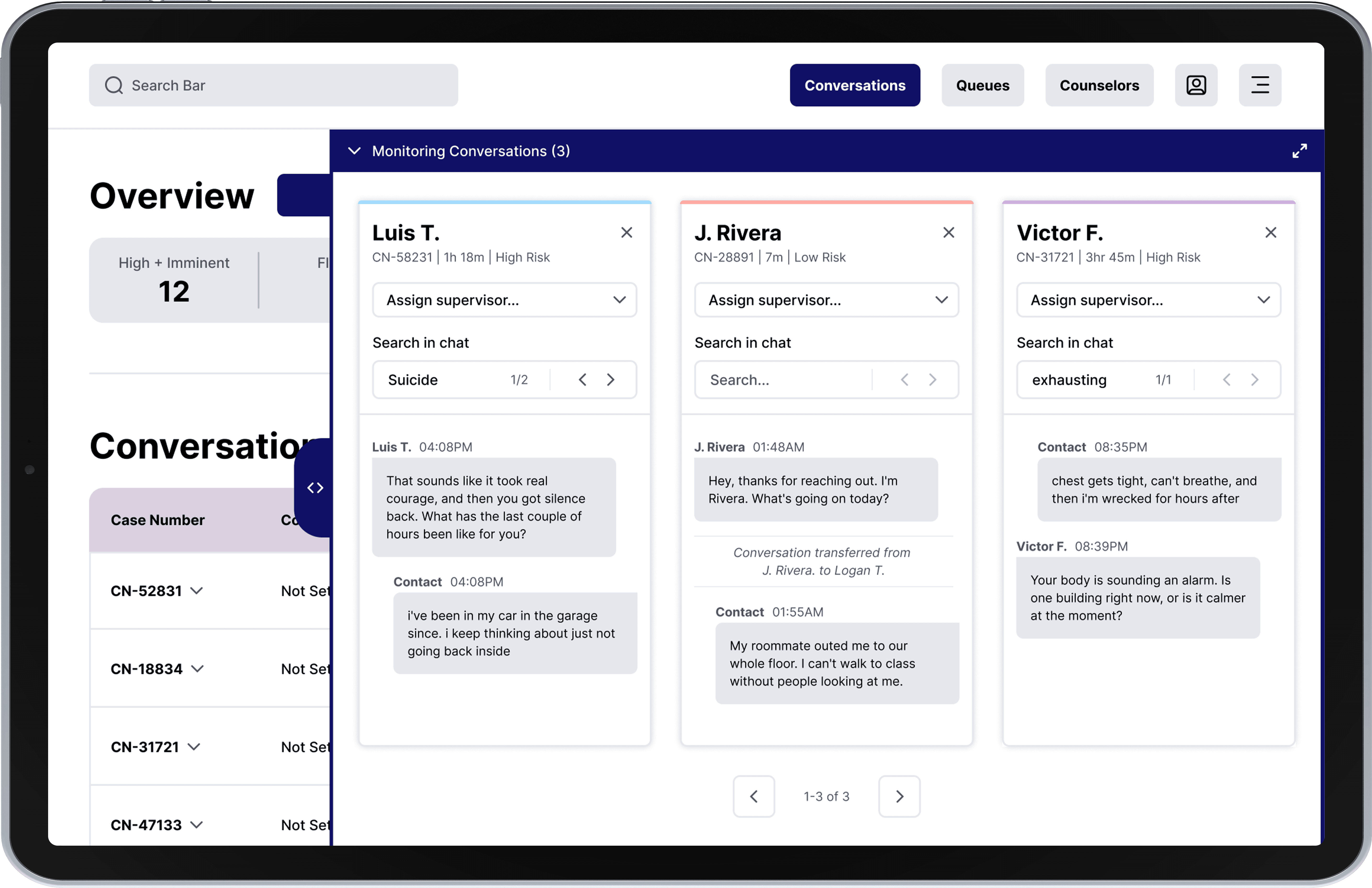
By expanding the "Monitoring Conversations" dock, users can easily track multiple interactions at once.

A mockup of a tablet screen displaying a light-themed digital dashboard with an expanded "Monitoring Conversations" dock covering the right side. The background shows an "Overview" metric card and a "Conversations" data log table.

Key Improvement #3

Lifeline Support

With integrated tools specifically tailored for Lifeline support, users can seamlessly monitor active calls directly from the dashboard.

A mockup of a tablet screen displaying a light-themed digital dashboard focused on Lifeline support services, with a main data panel and a right-side monitoring drawer.

Key Improvement #4

Dark Mode

With the introduction of a dark mode, users can significantly reduce eye strain during extended night shifts.

A mockup of a tablet screen displaying the digital dashboard in a dark mode theme, featuring high-contrast text and UI elements against a dark grey background to reduce eye strain.

Key Improvement #1

Dashboard Customization

By customizing and reordering dashboard columns, users can access critical data much faster.

A mockup of a tablet screen displaying a light-themed digital dashboard obscured by a centered modal overlay window titled "Add Columns" and "Manage Column Order".

Key Improvement #1

Dashboard Customization

By customizing and reordering dashboard columns, users can access critical data much faster.

A mockup of a tablet screen displaying a light-themed digital dashboard obscured by a centered modal overlay window titled "Add Columns" and "Manage Column Order".

Key Improvement #2

Expandable Dock

By expanding the "Monitoring Conversations" dock, users can easily track multiple interactions at once.

A mockup of a tablet screen displaying a light-themed digital dashboard with an expanded "Monitoring Conversations" dock covering the right side. The background shows an "Overview" metric card and a "Conversations" data log table.

Key Improvement #2

Expandable Dock

By expanding the "Monitoring Conversations" dock, users can easily track multiple interactions at once.

A mockup of a tablet screen displaying a light-themed digital dashboard with an expanded "Monitoring Conversations" dock covering the right side. The background shows an "Overview" metric card and a "Conversations" data log table.

Key Improvement #3

Lifeline Support

With integrated tools specifically tailored for Lifeline support, users can seamlessly monitor active calls directly from the dashboard.

A mockup of a tablet screen displaying a light-themed digital dashboard focused on Lifeline support services, with a main data panel and a right-side monitoring drawer.

Key Improvement #3

Lifeline Support

With integrated tools specifically tailored for Lifeline support, users can seamlessly monitor active calls directly from the dashboard.

A mockup of a tablet screen displaying a light-themed digital dashboard focused on Lifeline support services, with a main data panel and a right-side monitoring drawer.

Key Improvement #4

Dark Mode

With the introduction of a dark mode, users can significantly reduce eye strain during extended night shifts.

A mockup of a tablet screen displaying the digital dashboard in a dark mode theme, featuring high-contrast text and UI elements against a dark grey background to reduce eye strain.

Key Improvement #4

Dark Mode

With the introduction of a dark mode, users can significantly reduce eye strain during extended night shifts.

A mockup of a tablet screen displaying the digital dashboard in a dark mode theme, featuring high-contrast text and UI elements against a dark grey background to reduce eye strain.

Key Improvement #1

Dashboard Customization

By customizing and reordering dashboard columns, users can access critical data much faster.

Key Improvement #1

Dashboard Customization

By customizing and reordering dashboard columns, users can access critical data much faster.

A mockup of a tablet screen displaying a light-themed digital dashboard obscured by a centered modal overlay window titled "Add Columns" and "Manage Column Order".

Key Improvement #2

Expandable Dock

By expanding the "Monitoring Conversations" dock, users can easily track multiple interactions at once.

Key Improvement #2

Expandable Dock

By expanding the "Monitoring Conversations" dock, users can easily track multiple interactions at once.

A mockup of a tablet screen displaying a light-themed digital dashboard with an expanded "Monitoring Conversations" dock covering the right side. The background shows an "Overview" metric card and a "Conversations" data log table.

Key Improvement #3

Lifeline Support

With integrated tools specifically tailored for Lifeline support, users can seamlessly monitor active calls directly from the dashboard.

Key Improvement #3

Lifeline Support

With integrated tools specifically tailored for Lifeline support, users can seamlessly monitor active calls directly from the dashboard.

A mockup of a tablet screen displaying a light-themed digital dashboard focused on Lifeline support services, with a main data panel and a right-side monitoring drawer.

Key Improvement #4

Dark Mode

With the introduction of a dark mode, users can significantly reduce eye strain during extended night shifts.

Key Improvement #4

Dark Mode

With the introduction of a dark mode, users can significantly reduce eye strain during extended night shifts.

A mockup of a tablet screen displaying the digital dashboard in a dark mode theme, featuring high-contrast text and UI elements against a dark grey background to reduce eye strain.

Process

1. Research

  • User interviews

  • Heuristic Evaluation

  • Persona

2. Design

  • Low-Fidelity Wireframes

  • Design System

  • High-Fidelity Prototype

3. Refine

  • Usability Testing

  • Design Iterations

4. Final

  • Impact

  • Feedback

1. Research

User Interviews

My team and I conducted user interviews to learn about our users' workflows, behaviors, and pain points. Mapping our data with an affinity wall revealed three primary workflow pain points.

Unnecessary Dashboard Data

There were columns on the dashboard that users found unnecessary, overly long, or incorrectly formatted.

Opportunity:

Allow users to customize the dashboard by rearranging the columns and choosing what columns to display.

Missing Lifeline Features

Lifeline users rarely used the dashboard because it lacked helpful features for them, such as the ability to monitor a live conversation.

Opportunity:

Support Lifeline users on the dashboard by implementing features for monitoring live phone calls from the dashboard.

Night Shift Visual Fatigue

Since many users work night shifts, the bright background can cause eye strain during long overnight monitoring shifts.

Opportunity:

Implement a dark mode for the dashboard to increase accessibility.

Heuristic Evaluation

To further discover ways to enhance the user experience of the dashboard, we performed a heuristic evaluation to find more usability issues within the original design. Based on our findings, we identified two critical usability issues.

Flexibility and Efficiency of Use

The dashboard only allowed users to monitor three conversations at a time, but they often needed to monitor more than five conversations.

Opportunity:

Redesign the "Monitoring Conversations" dock to help users monitor more conversations at a time.

Consistency and Standards

Several areas of the dashboard had low color contrast, making it hard for users to read the text clearly.

Opportunity:

Increase the color contrast and font weight to align with Web Content Accessibility Guidelines (WCAG), ensuring a minimum contrast ratio of 4.5:1.

Persona

By analyzing common patterns across our research, we developed a primary persona to represent the daily workflows and friction points of our users. This archetype keeps real-world needs at the center of every feature decision.

A side profile photo of Ian, a young man sitting at a desk in a dimly lit room at night. He is focused on a glowing computer monitor that casts a cool blue light over his workspace.

Ian

34 years old

Irvine, CA

Biography

Biography

Ian is a employee at The Trevor Project who is responsible for monitoring live crisis conversations across digital platforms. However, the structure of the internal dashboard prevents him from viewing information effectively.

Ian is a employee at The Trevor Project who is responsible for monitoring live crisis conversations across digital platforms. However, the structure of the internal dashboard prevents him from viewing information effectively.

Frustrations

  • Struggling to focus on high-priority data due to unnecessary columns.

  • Being forced to switch between platforms to monitor live phone calls.

  • Experiencing eye strain from long overnight monitoring shifts.

Goal

  • To streamline daily monitoring workflows with a customizable dashboard that accommodates low-light night-shift environments.

2. Design

Low-Fidelity Wireframes

To map out the layout structure, we initiated the design process with low-fidelity wireframes driven by three structural goals:

  1. Protect Mental Models: Preserved the original core dashboard framework to ensure a seamless transition and eliminate user retraining friction.

  2. Lower Cognitive Load: Systematically eliminated visual clutter, redundant iconography, and unnecessary formatting elements to optimize focus.

  3. Space for New Features: Used the newly cleared space to smoothly add new features without breaking the main layout.

Low-fidelity wireframe of a crisis dashboard featuring an overview table and an expanded right-side vertical chat monitoring panel.
Low-fidelity wireframe of a queue metrics dashboard displaying performance statistics in a visual grid card layout.
Low-fidelity wireframe of a dashboard obscured by a centered Add Columns and Manage Column Order modal overlay window.
Low-fidelity wireframe of a queue metrics dashboard displaying performance statistics in a structured horizontal table view.
Low-fidelity wireframe of a crisis dashboard featuring an overview table and an expanded right-side vertical chat monitoring panel.
Low-fidelity wireframe of a dashboard obscured by a centered Add Columns and Manage Column Order modal overlay window.
Low-fidelity wireframe of a queue metrics dashboard displaying performance statistics in a visual grid card layout.
Low-fidelity wireframe of a queue metrics dashboard displaying performance statistics in a structured horizontal table view.

Design System

To scale The Trevor Project's dashboard efficiently, we established a foundational design system using the organization’s official color palette to ensure absolute visual and behavioral consistency. By standardizing color tokens, typographic hierarchies, and reusable interactive components, it reduces user cognitive load while accelerating front-end deployment.

(Curated snapshot. Comprehensive design system includes complete styles and component variants.)

Colors

Colors

Primary

900

#030314

700

#0A0A3D

500

#101066

300

#7070A3

100

#CFCFE0

Secondary

900

#33120C

700

#993625

500

#FF5A3D

300

#FF9C8B

100

#FFDED8

Typography

Typography

Heading 1

Heading 1

Aa

Aa

Font: Inter

Font: Inter

Weight: Bold

Weight: Bold

Size: 40px

Size: 40px

Heading 2

Heading 2

Aa

Aa

Font: Inter

Font: Inter

Weight: Bold

Weight: Bold

Size: 32px

Size: 32px

Heading 3

Heading 3

Aa

Aa

Font: Inter

Font: Inter

Weight: Bold

Weight: Bold

Size: 24px

Size: 24px

Body 1

Body 1

Aa

Aa

Font: Inter

Font: Inter

Weight: Regular

Weight: Regular

Size: 16px

Size: 16px

Body 2

Body 2

Aa

Aa

Font: Inter

Font: Inter

Weight: Regular

Weight: Regular

Size: 14px

Size: 14px

UI Elements

UI Elements

Primary Buttons (5 states)

A row of interactive button components showcasing five design states: Default, Hover, Active, Focus with a thick outline, and a faded Disabled state.
Two rows of interactive button components showcasing five design states: Default, Hover, Active, Focus with a thick outline, and a faded Disabled state.

Column Options (6 states)

A grid of text input fields showcasing six design states for a First Name form field: Default, Hover, Active, Focus with a bold border, Success with a green checkmark, and Error with a red border and helper message.

High-Fidelity Prototype

We combined the wireframes and design system into a fully interactive high-fidelity prototype using Claude Design. This design transition focused on two strategic pillars:

  1. Color Strategy: Implemented a clean foundation using a tinted neutral palette. This keeps the data-dense interface visually cohesive while ensuring strong color contrast.

  2. Workflow Efficiency: Built an inline chat drawer, added clear drag-and-drop affordances to the column customizer, and used distinct button weights (Cancel vs. Save) to prevent accidental misclicks.
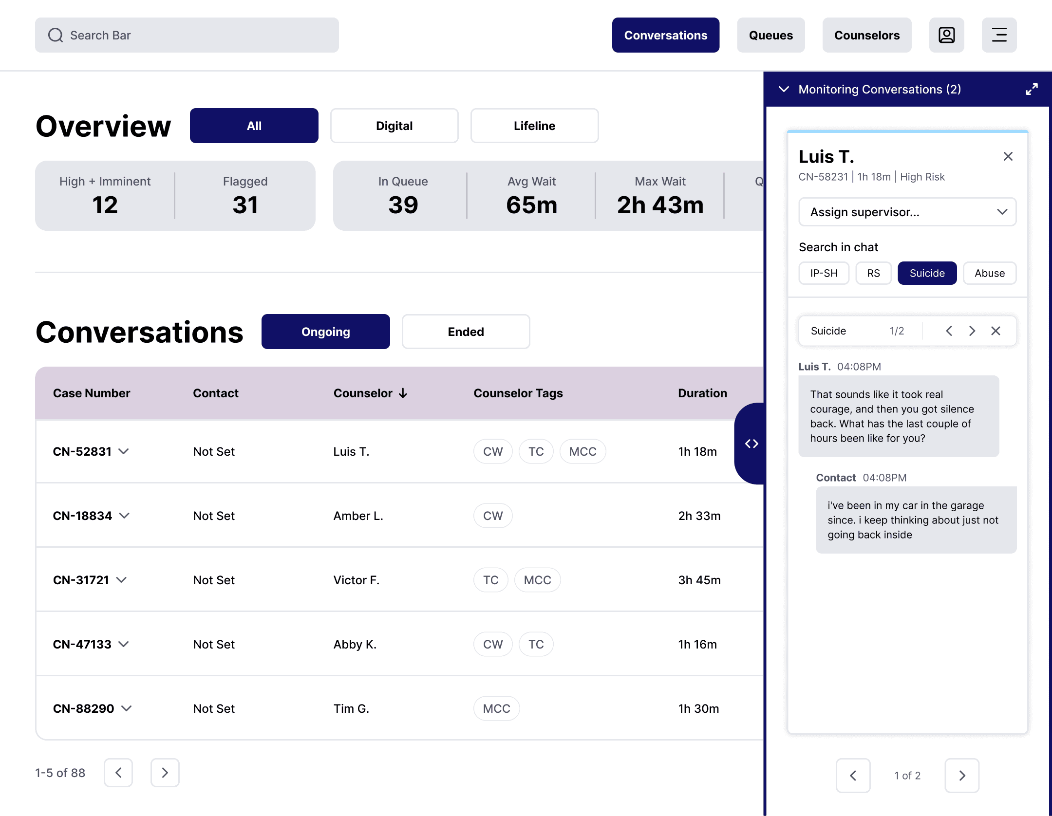
High-fidelity mockup of a crisis dashboard featuring an overview table and an expanded right-side vertical chat monitoring panel.
High-fidelity mockup of a queue metrics dashboard displaying performance statistics in a visual grid card layout.
High-fidelity mockup of a dashboard obscured by a centered Add Columns and Manage Column Order modal overlay window.
High-fidelity mockup of a queue metrics dashboard displaying performance statistics in a structured horizontal table view.
High-fidelity mockup of a crisis dashboard featuring an overview table and an expanded right-side vertical chat monitoring panel.
High-fidelity mockup of a dashboard obscured by a centered Add Columns and Manage Column Order modal overlay window.
High-fidelity mockup of a queue metrics dashboard displaying performance statistics in a visual grid card layout.
High-fidelity mockup of a queue metrics dashboard displaying performance statistics in a structured horizontal table view.

3. Refine

Usability Testing

We conducted moderated usability testing to validate the functionality of our redesign. Below are two of the critical issues we uncovered:

  1. Limited Search Functionality: Participants could only search within chat logs by clicking the pre-defined tags (IP-SH, RS, Suicide, Abuse). This restricted free-text or flexible searching.

  2. Missing Timestamps on Notes: The notes section lacks creation dates or times, making it difficult for supervisors or counselors to track case history and progression.

High-fidelity mockup of a crisis dashboard highlighting usability flaws, with red callout lines pointing to static search tags and a notes field lacking a timestamp.

Issue #1

Participants were only able to search for a message by the provided tags.

Issue #2

Participants could not tell when the notes were made, making it hard for them to track the case.

Issue #1

Participants were only able to search for a message by the provided tags.

High-fidelity mockup of a crisis dashboard highlighting usability flaws, with red callout lines pointing to static search tags and a notes field lacking a timestamp.

Issue #2

Participants could not tell when the notes were made, making it hard for them to track the case.

Issue #1

Participants were only able to search for a message by the provided tags.

High-fidelity mockup of a crisis dashboard highlighting usability flaws, with red callout lines pointing to static search tags and a notes field lacking a timestamp.

Issue #2

Participants could not tell when the notes were made, making it hard for them to track the case.

Issue #1

Participants had to spend extra time navigating because key menu items were hidden inside the burger menu.

Participants were only able to search for a message by the provided tags.

High-fidelity mockup of a crisis dashboard highlighting usability flaws, with red callout lines pointing to static search tags and a notes field lacking a timestamp.

Issue #2

Participants did not realize that the two tabs were clickable due to low visual affordance.

Participants could not tell when the notes were made, making it hard for them to track the case.

Design Iterations

To resolve the core friction points identified by users, we implemented two major iterations:

  1. Flexible Message Search: The search tags were replaced by a search bar that allows users to manually enter keywords, giving users more flexibility to search for a message.

  2. Information Affordance: The "Notes" section was redesigned to provide more information about each note, helping users follow up on cases more efficiently.
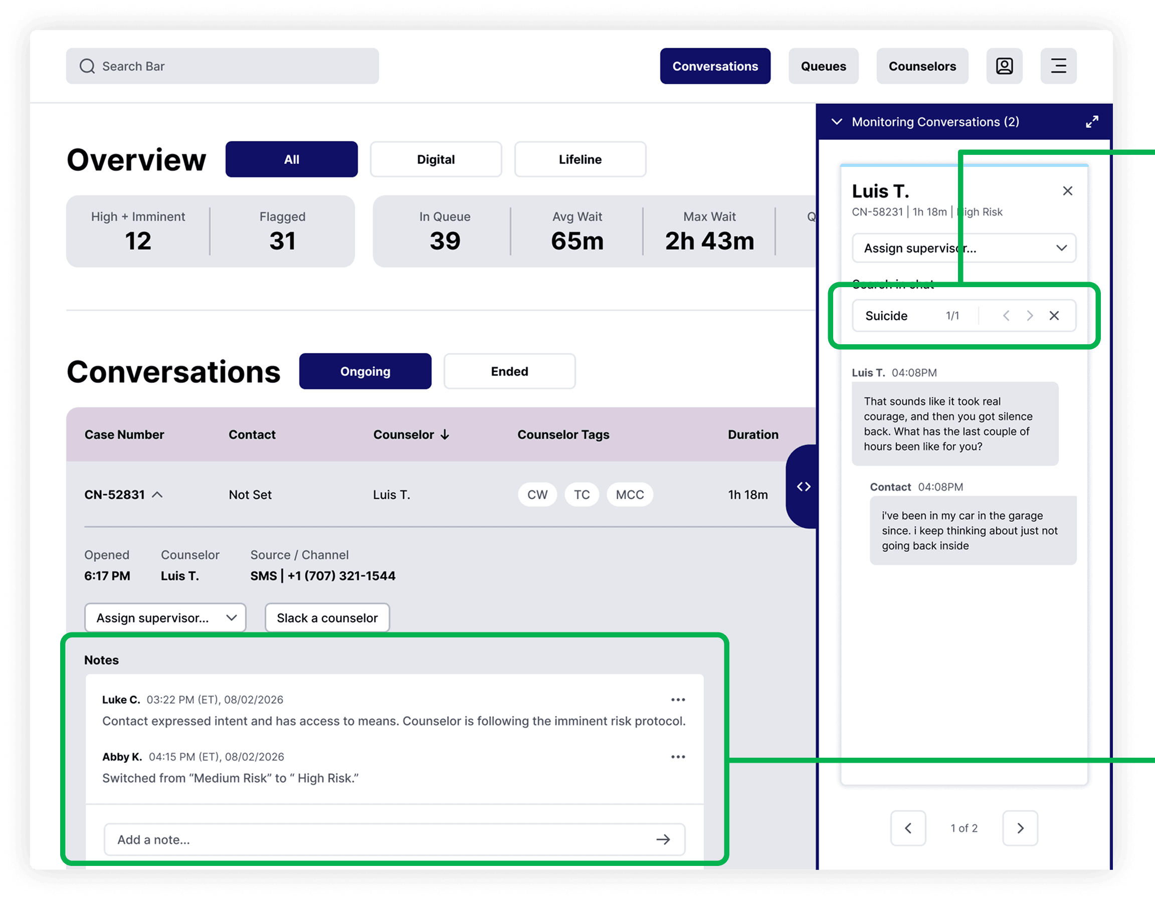
High-fidelity mockup of a redesigned crisis dashboard, with green callout lines pointing to an active inline keyword search bar and a notes field containing specific timestamps and user names.

Solution #1

A manual search bar replaced static tags, allowing users to enter keywords and flexibly search full message histories.

Solution #2

Timestamps and names were added to every entry in the Notes section to give supervisors a clear timeline of case progression.

Solution #1

A manual search bar replaced static tags, allowing users to enter keywords and flexibly search full message histories.

High-fidelity mockup of a redesigned crisis dashboard, with green callout lines pointing to an active inline keyword search bar and a notes field containing specific timestamps and user names.

Solution #2

Timestamps and names were added to every entry in the Notes section to give supervisors a clear timeline of case progression.

Solution #1

Solution #1

A manual search bar replaced static tags, allowing users to enter keywords and flexibly search full message histories.

High-fidelity mockup of a redesigned crisis dashboard, with green callout lines pointing to an active inline keyword search bar and a notes field containing specific timestamps and user names.

Solution #2

Solution #2

Timestamps and names were added to every entry in the Notes section to give supervisors a clear timeline of case progression.

Solution #1

The key menu items are pulled out of the burger menu to save users time when switching between primary pages.

A manual search bar replaced static tags, allowing users to enter keywords and flexibly search full message histories.

A manual search bar replaced static tags, allowing users to enter keywords and flexibly search full message histories.

High-fidelity mockup of a redesigned crisis dashboard, with green callout lines pointing to an active inline keyword search bar and a notes field containing specific timestamps and user names.

Solution #2

By following real-world conventions, users can quickly know the functionality of the UI Elements.

Timestamps and names were added to every entry in the Notes section to give supervisors a clear timeline of case progression.

4. Final

Impact

During the final round of usability testing and heuristic evaluation, we measured three key metrics to validate the successful redesign of The Trevor Project's dashboard.

Heuristic Principles

8 usability issues identified during heuristic evaluations were eliminated by the dashboard redesign.

Workflow Enhancement

All participants confirmed that more than 86% of the new designs and features improved their daily workflows.

Feature Learnability

The new features achieved an average 95% ease-of-learning rating from participants.

Feedback

To further validate our design decisions, we collected direct insights from team leadership on the updated dashboard experience.

"I found the ability to monitor multiple chats to be most valuable, and being able to slide to side-by-side ongoing interactions is helpful as opposed to having to toggle. While I did not find any parts of the redesigned dashboard to be unnecessary, some of the variables may not be as useful as others, but this is a great aspect of the ways it was designed to be customizable based on the focus."

- Lisa Stewart, Team Lead

"The most valuable features are the visual layout, which increases readability and accessibility for dashboard users. Additionally, the ability to monitor Lifeline conversations would increase safety for both counselors and contacts."

- Anonymous, Team Lead

Other Case Study

Other Case Studies

Other Case Studies

Other Case Studies

Contact

victorf588@gmail.com

© 2026 Victor Fang.

Contact

victorf588@gmail.com

© 2026 Victor Fang.

Contact

victorf588@gmail.com

© 2026 Victor Fang.